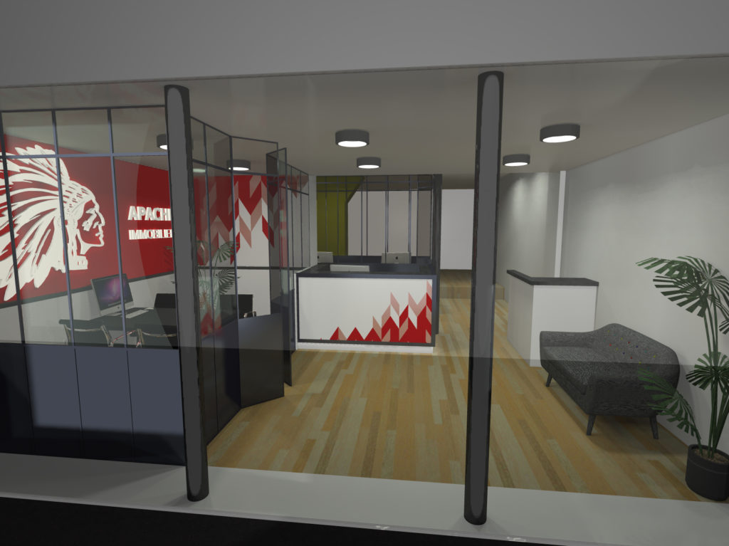
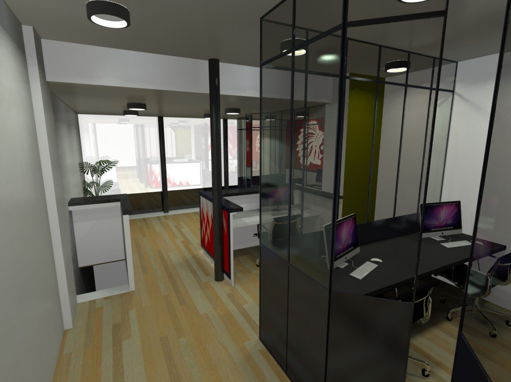
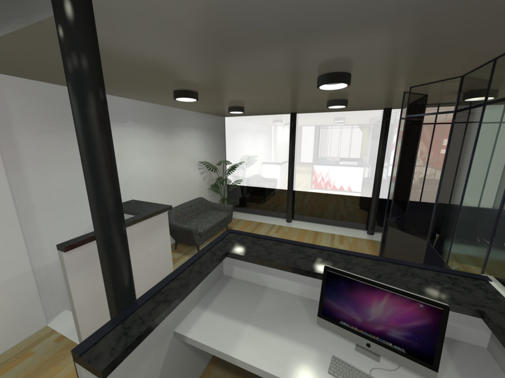
The idea here was to re-organize the flow of the entrance of the agency.
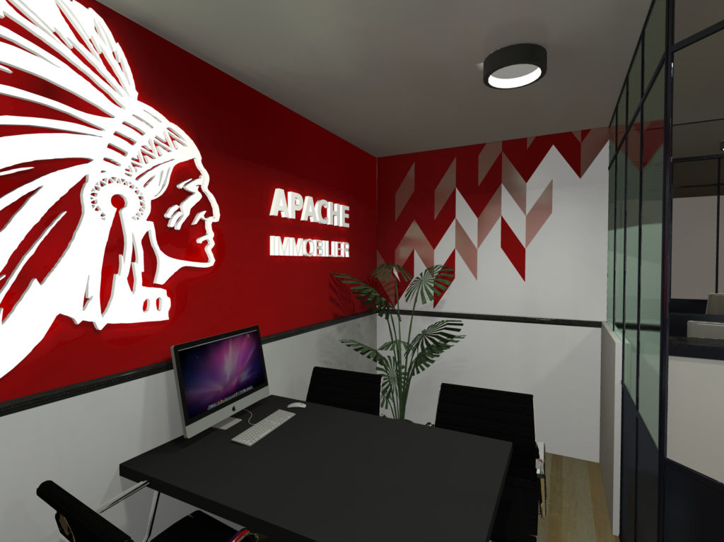
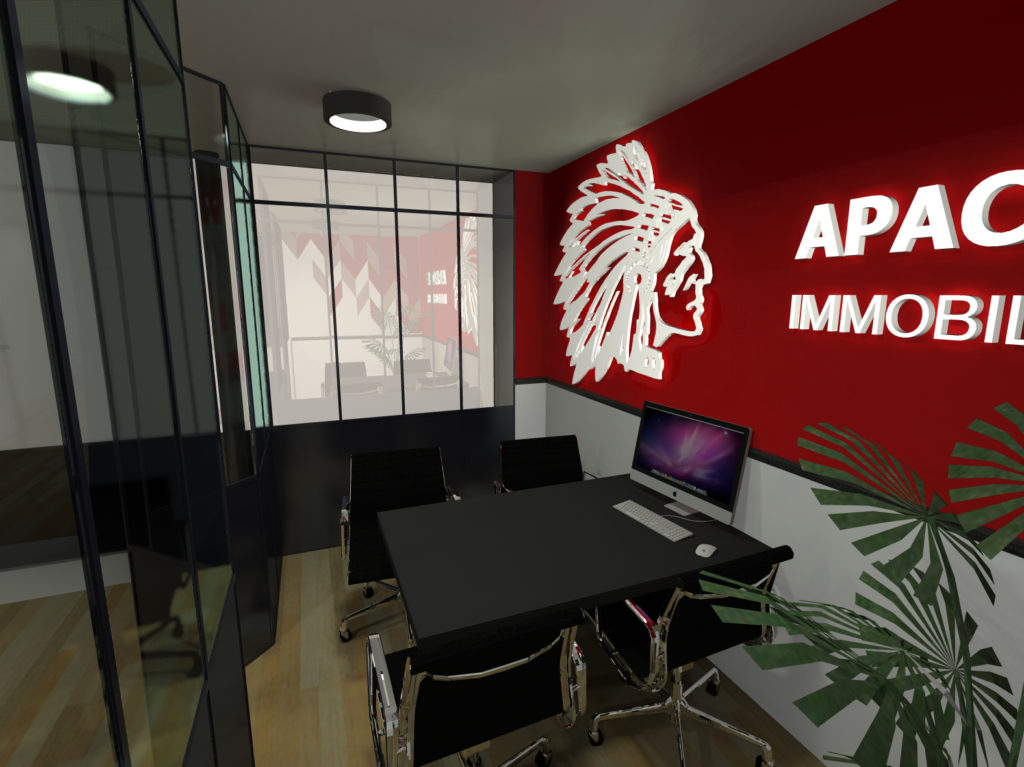
We needed to add new functions as well as create a style for the agency in line with their powerful red already in place in their marketing strategy. The open space will be partitioned into a meeting/signing room, a proper front desk to welcome clients and an administrative cubicle.
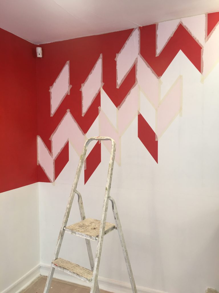
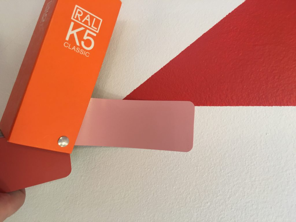
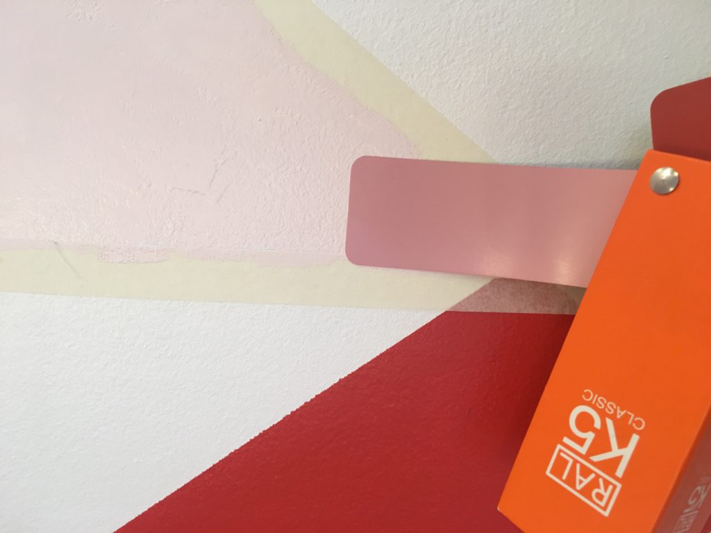
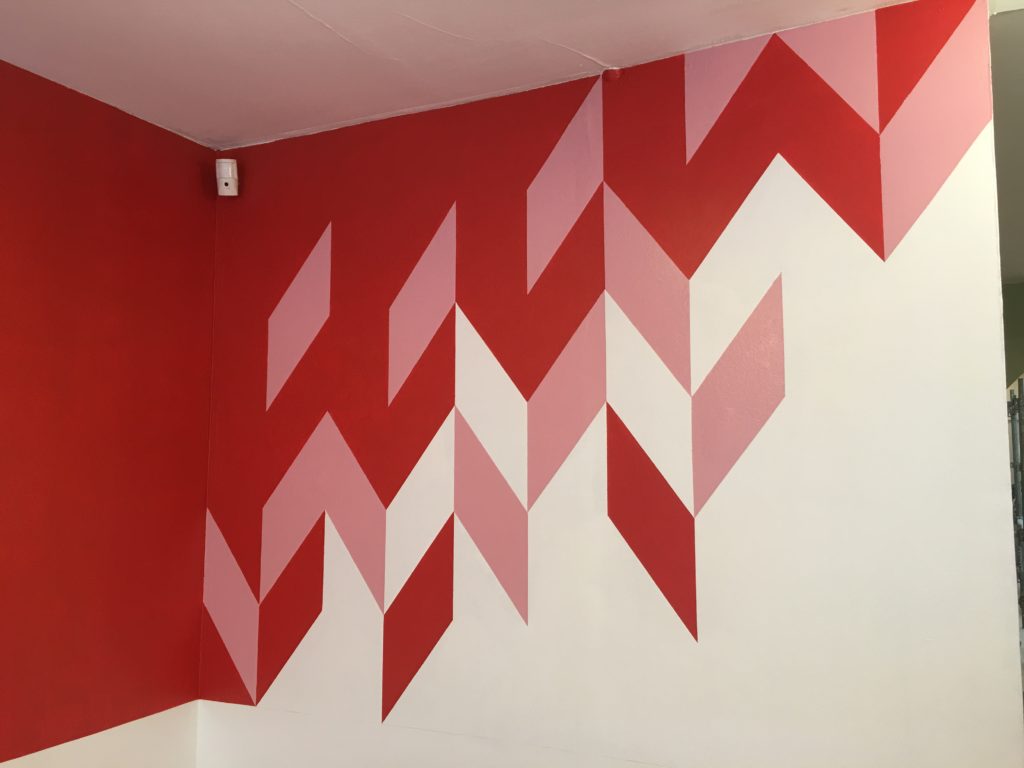
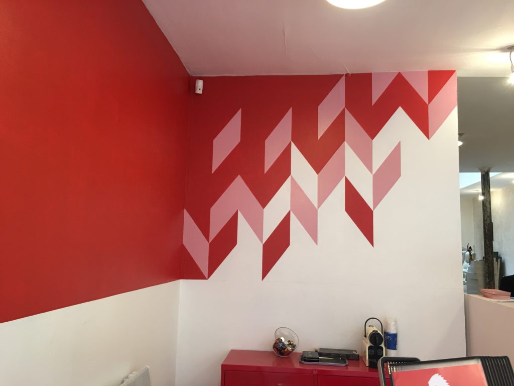
The main concept is the fading and blending of the red into the white. The idea was to avoid any gradient including shades of pink. Option was taken to shematize it with geometrical shapes and create the illusion of a transition by adding a third colour carefully chosen not to impact on the red too much.
Stage 1: 3D modelling
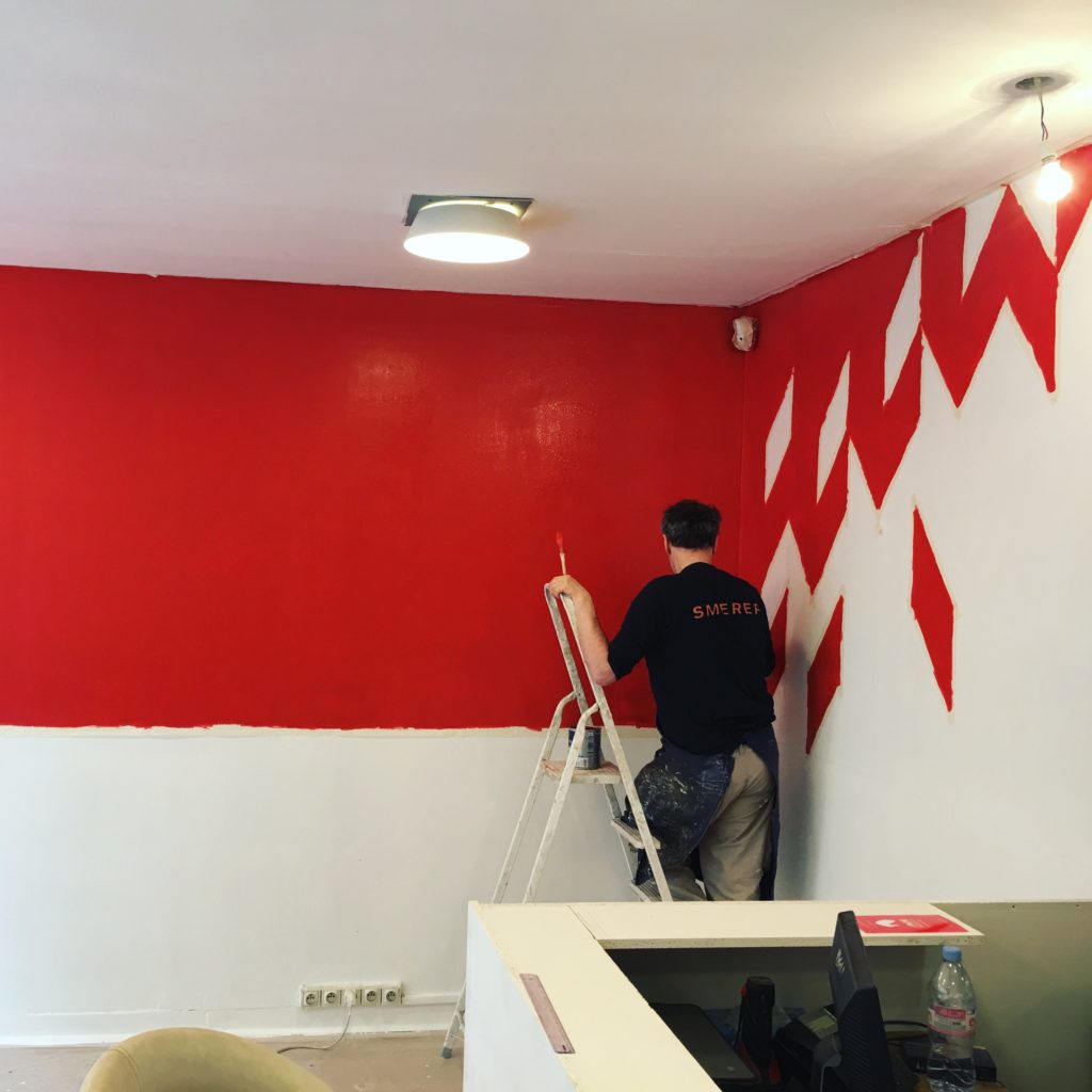
Stage 2: Realisation of the design
After a lot of masking tape and a slight color adjustment, the design takes shape in the real world…


