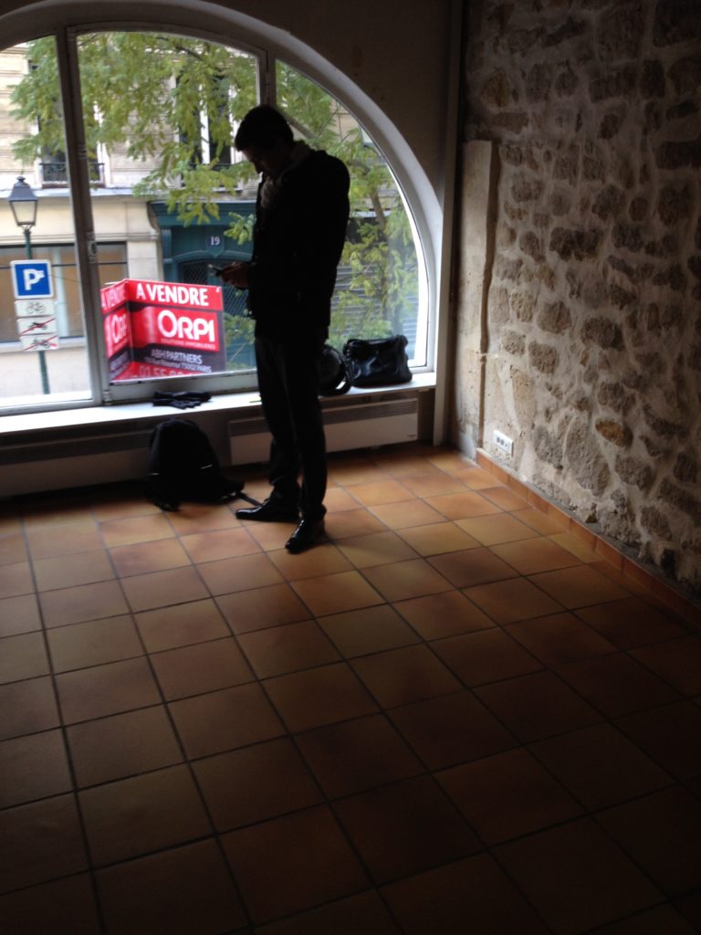
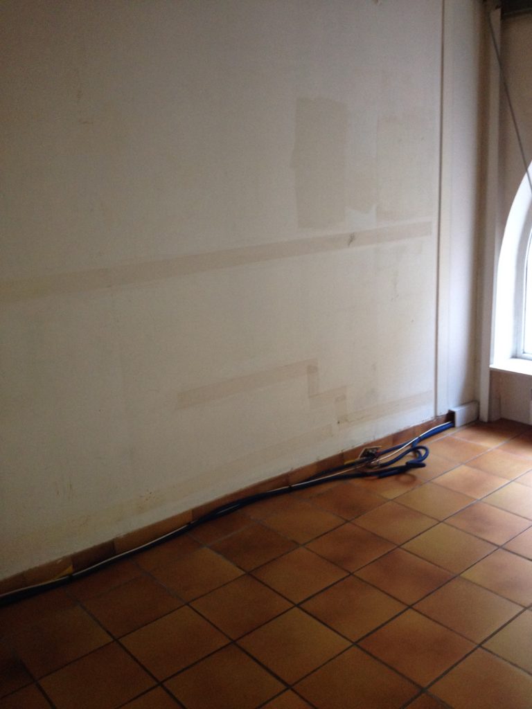
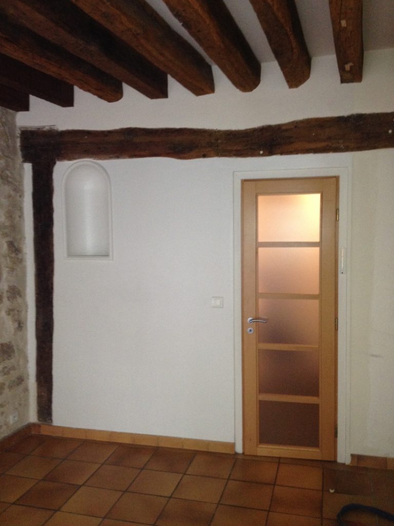
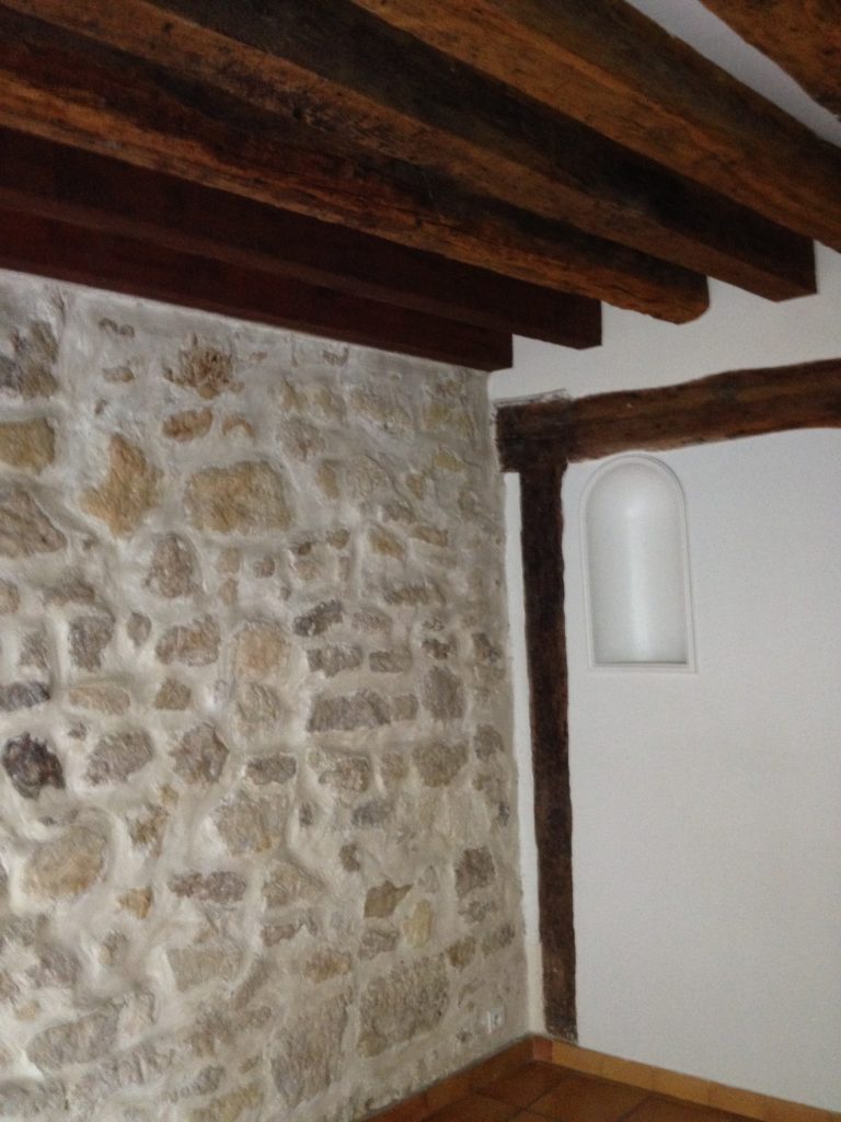
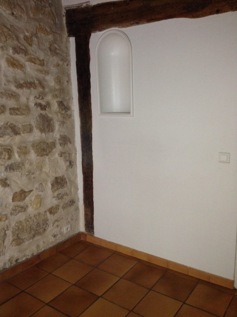
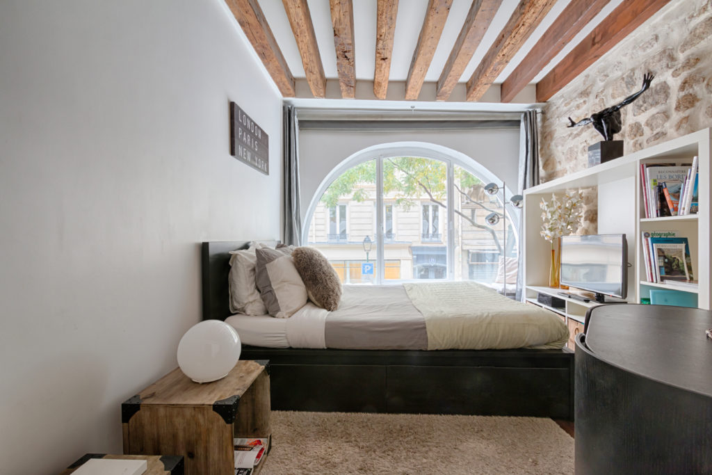
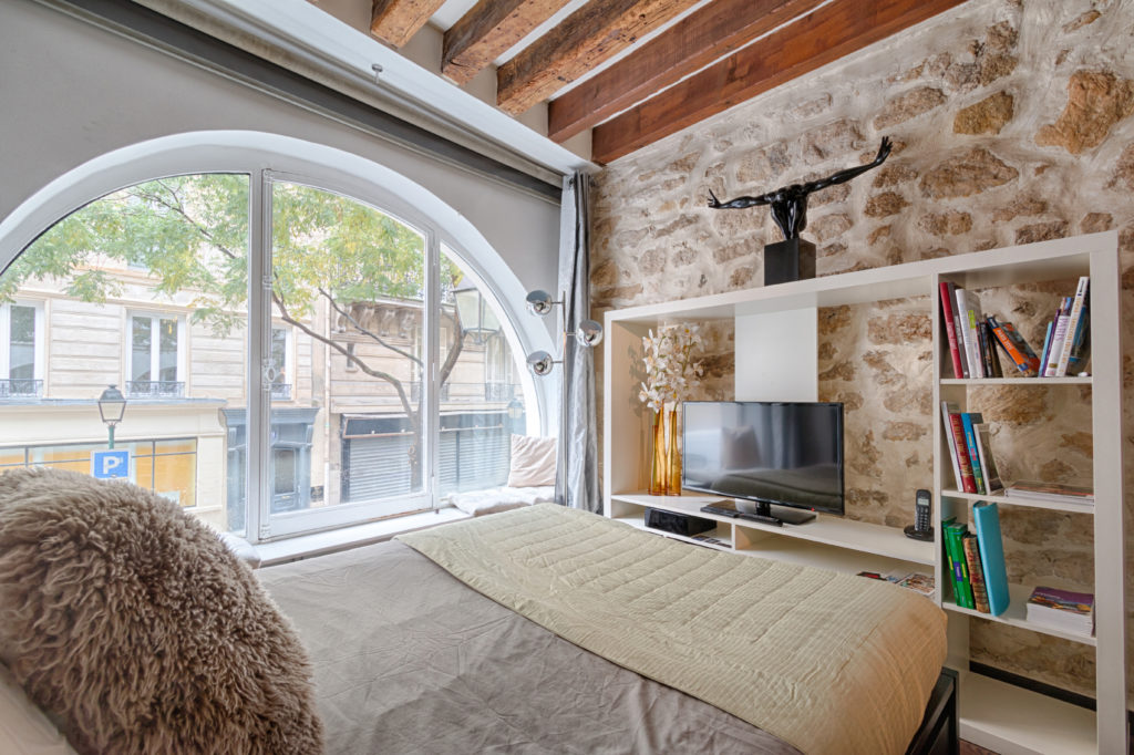
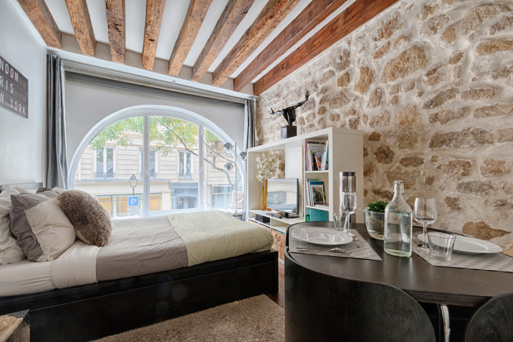
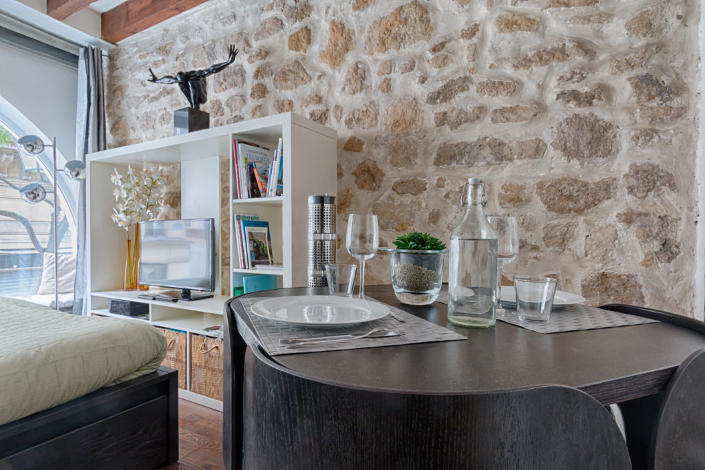
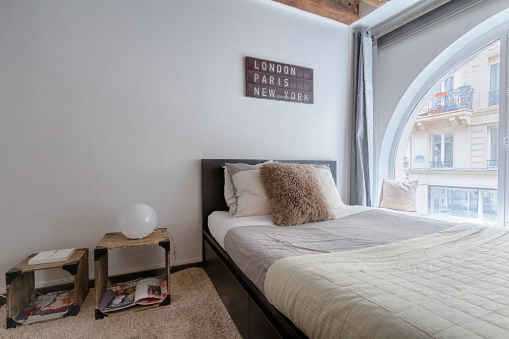
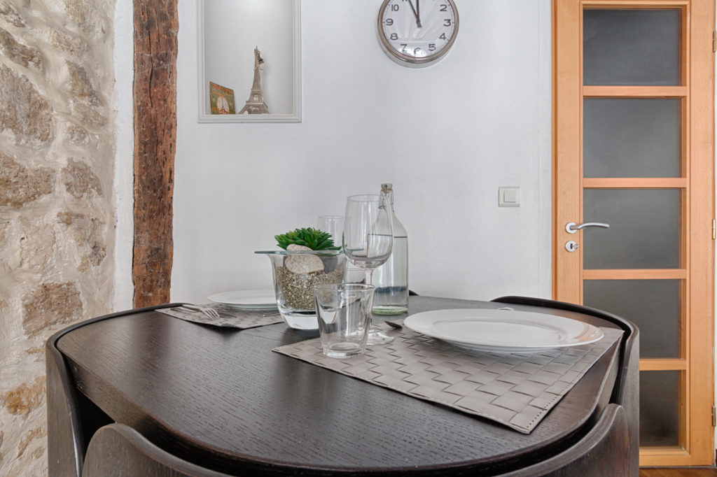
Loved in the heart of the pedestrian district of Montorgueil, this flat has it all: a large bay window overlooking the street, wooden beams, stone wall. All it needed was a little bit of TLC and some “designed by Pierre” magic.
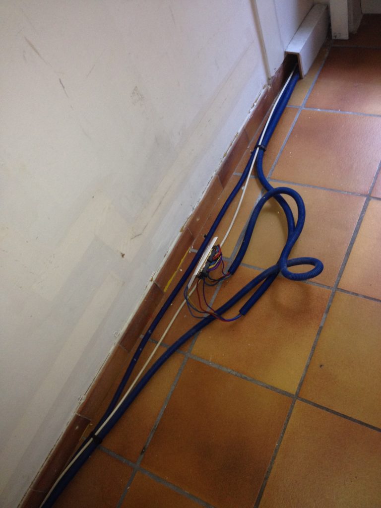
The style chosen for this project is a cliché vision of a typical Parisian flat with all the charms of the old, but a hit of new as well to make it modern and contemporary. Flooring needed to be changed to make it feel more cosy. The tiles were levelled, so there was no need to re-lay the floor and we could just add a layer of wooden floor on a bed of acoustic foam to insulate from the sound under (flat is on first level, above building’s front door).
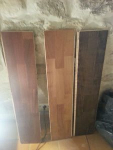
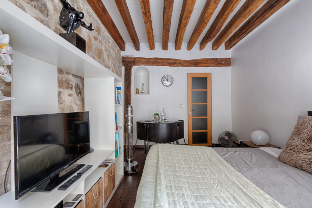
In order to give a modern feel to the flat, we chose a dark brown flooring. This was the starting element for the whole interior decoration of the room. The color installs a contrast with the white of the walls and, later, some of the furniture.
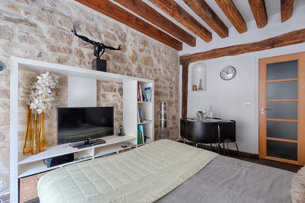
In order not to block out the view to the bay window from the room entrance, we chose low furniture: bedside tables are below the bed level, the chairs don’t go higher than the table and the TV unit is on the wall to the side.
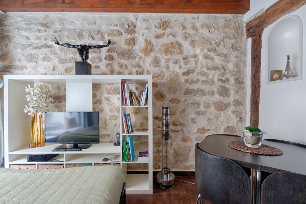
In order to maximise the effect of the stone wall, we chose a shelving unit without a closed back in order to be able to see through it.
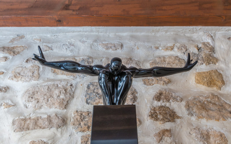
Most of the decorative elements are sourced from main stores such as IKEA (bedding, TV unit, table & chairs, wall clock), confodéco (lamp post, eiffel tower) and But déco (statue, bedside tables, frame). Sound tower is by Jean-Michel Jarre, vases by Villeroy & Boch.
By mixing different shops, it is important to stick to the chosen style and keep a global view of the ensemble you are creating, so that it forms a unity once all put together. For instance, try not to mix the colours / fabrics / materials unless they are ment to be together. Here we chose chrome throughout the flat, so we wouldn’t have included elements in copper, bronze… as they would have looked out of place. We will see in another home staging exemple the use of copper and how to include it in your project.
We will note that the bedding matches the rug and that the place mats match the curtains. The only hint of colour is brought by the vases that add warmth to the project. They are placed on the window side, so they can have the natural light and be visible from the door.
The TV unit have been brought to life by the practical adding of natural coconut boxes that were added to the bottom of the shelving unit. This visually also separate 3 functionalities: storage at the bottom, TV unit in the center and shelving on the right.

