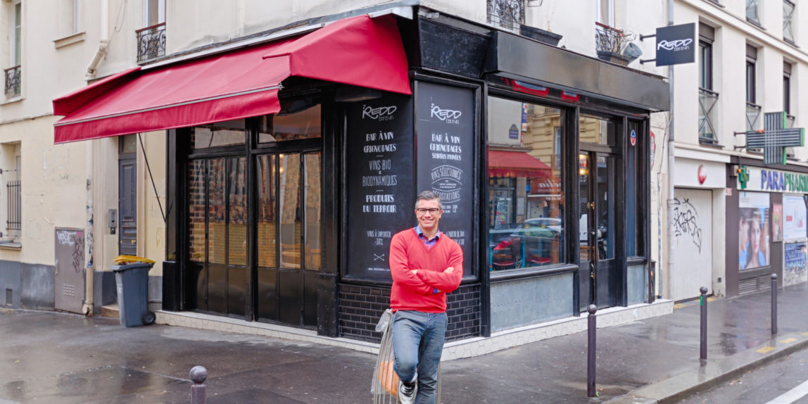
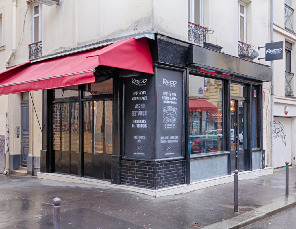
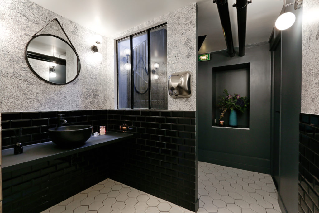
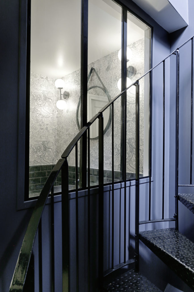
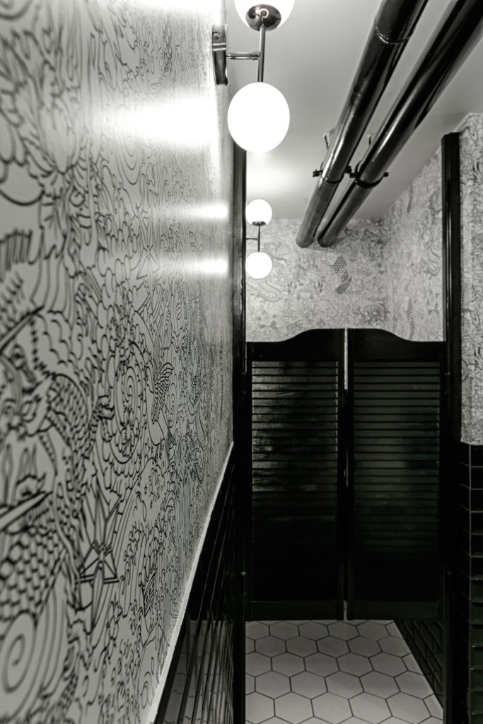
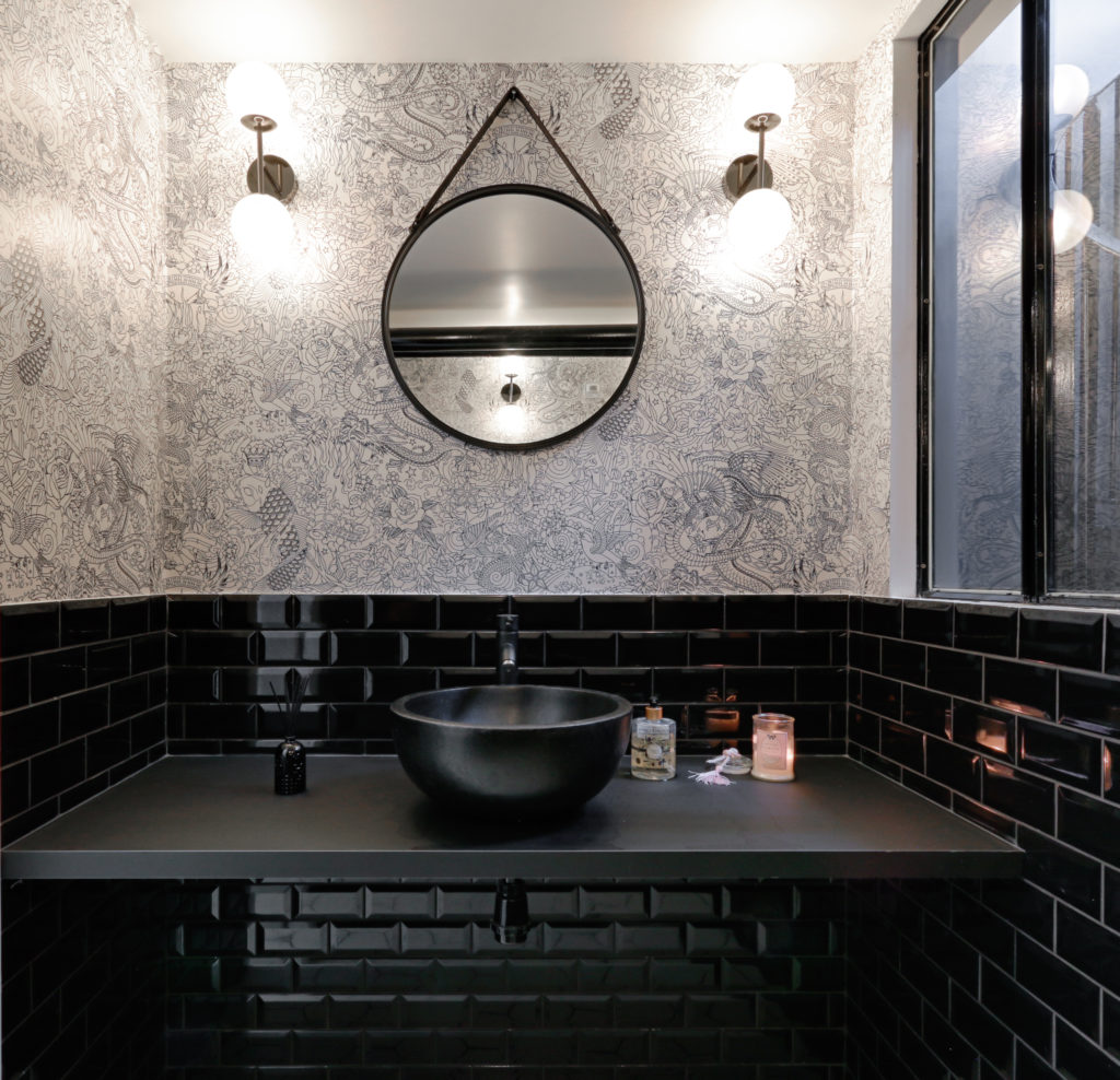
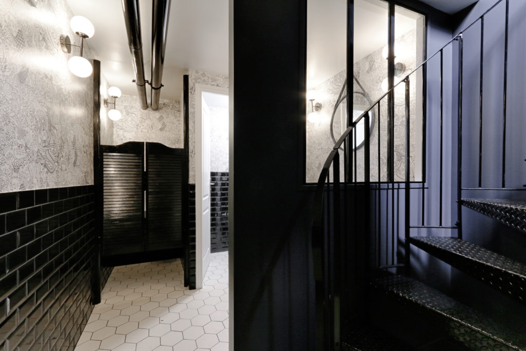
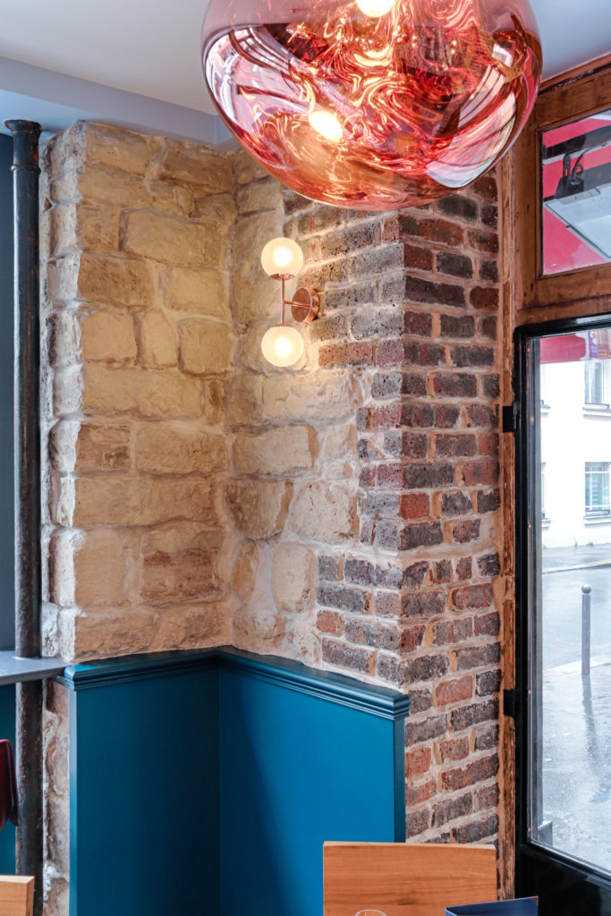
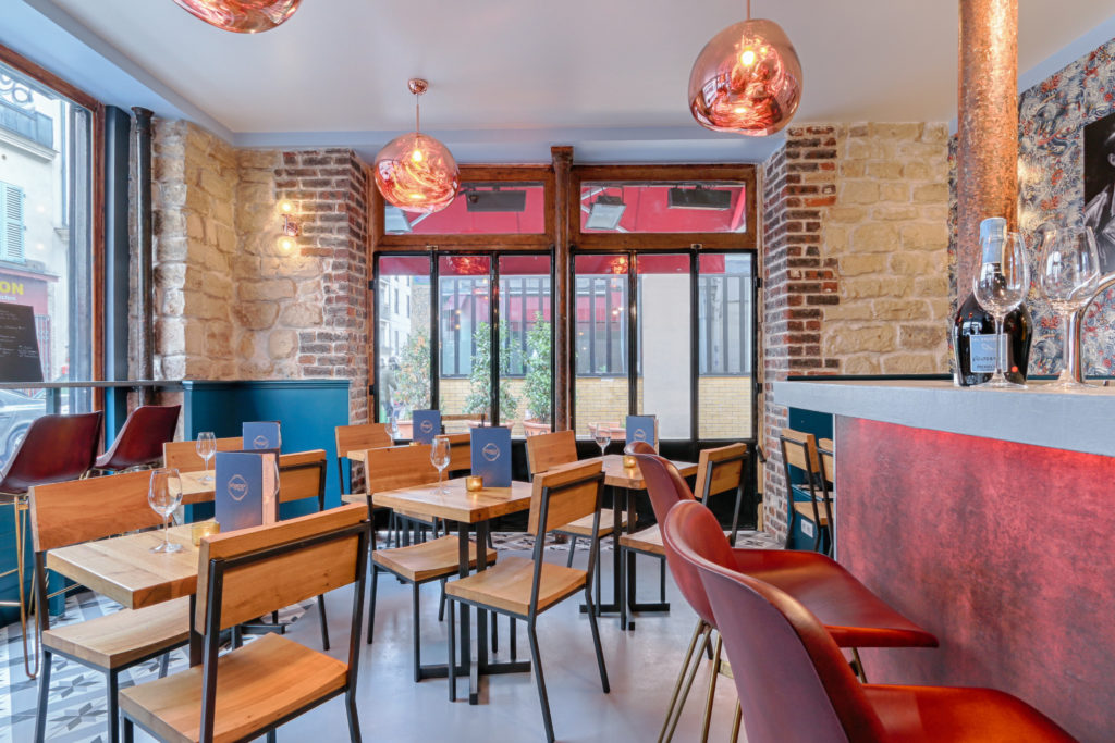
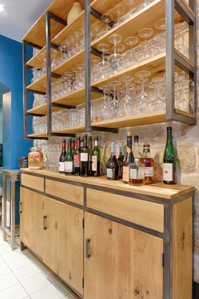
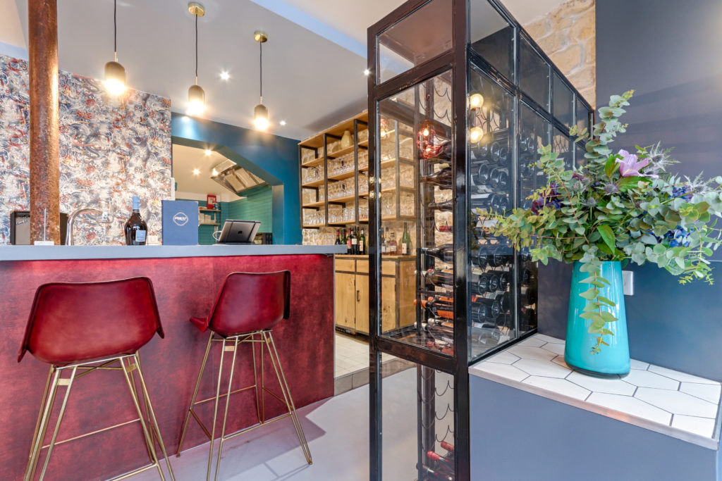
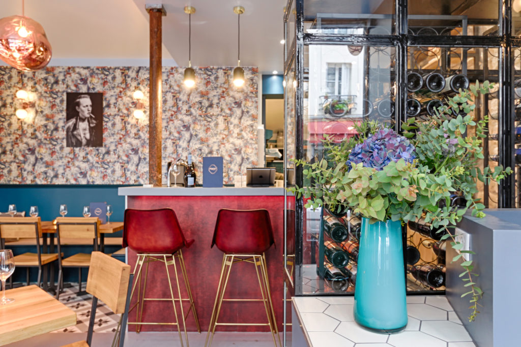
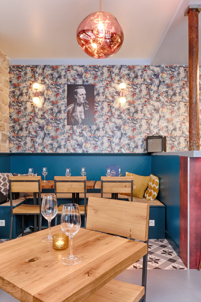
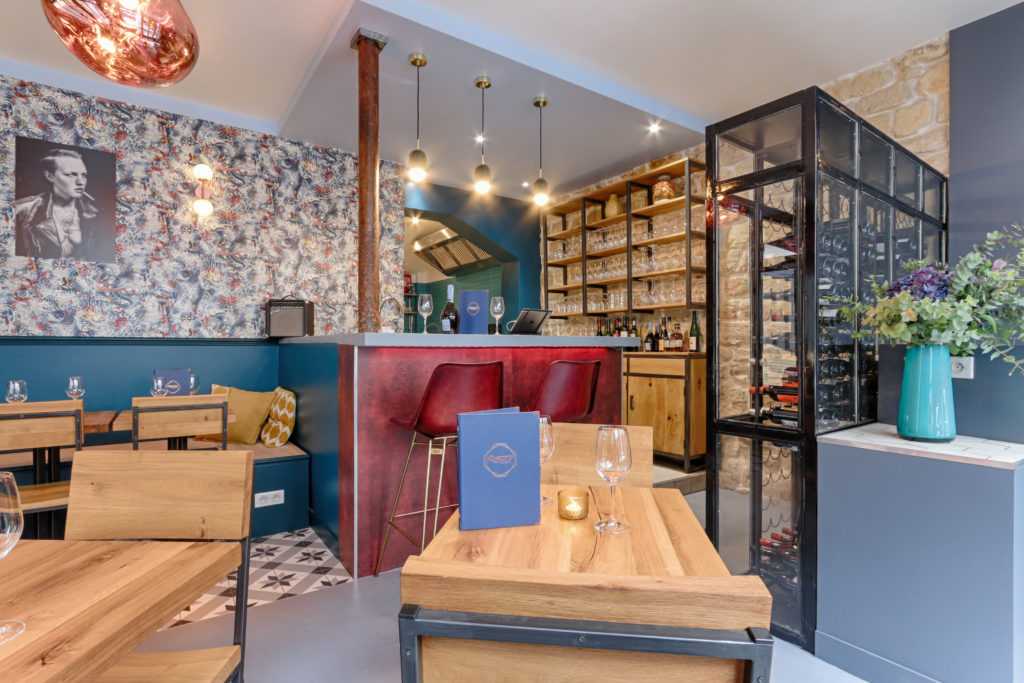
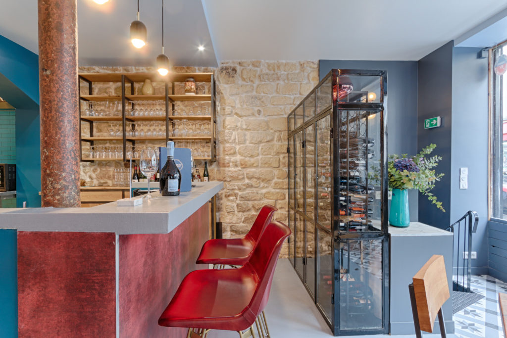
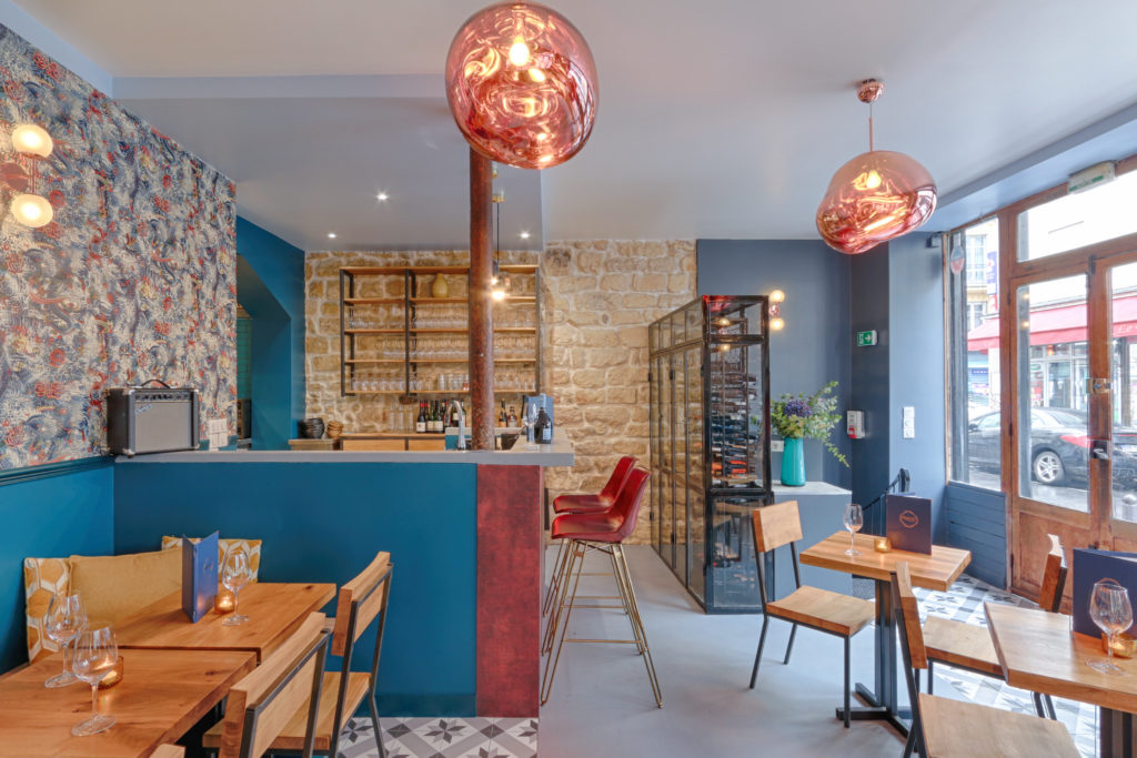
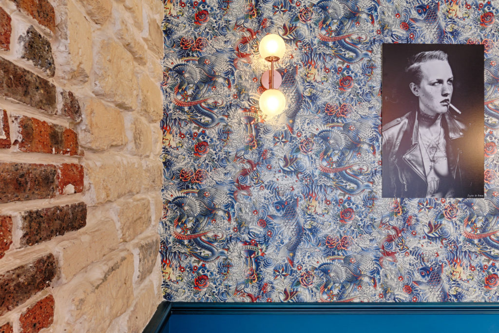
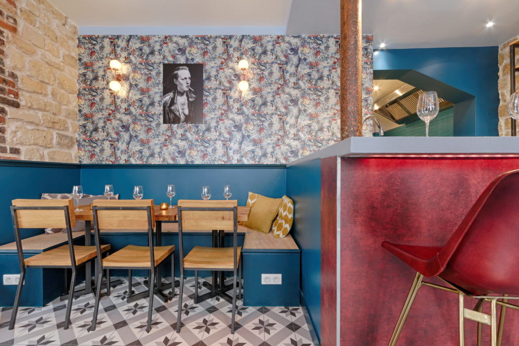
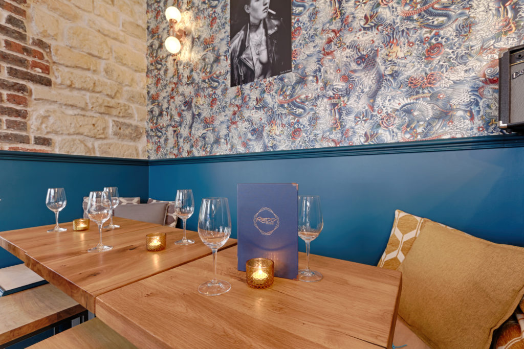
It’s an exciting thing to be part of such a business development. As part of their spending strategy, REDD was consulted by Pierre because they needed a strong visual impact for the launch of their second wine bar. A blank and only brief page that we had to follow was that we had to appeal to their target audience who is a young professional, sophisticated and educated, but with an advantage. There had to be a Visual link between the first and second wine bar and the 2.0 Edition needed to be strong enough, so it could be reproduced in a third and so on on the bars… The owners gave me their full confidence and followed my bold design choices: from Tom Dixon MELT fixtures to Jean-Paul GAULTIER wallpaper, the black and white bathroom… For floor and space use, the guidelines were mainly the storage needed for daily use and the number of seats for the floor plan. We ended up designing custom furniture for the floor and bar directly from the Czeck Republic, where master D is from. The opening night was a huge success and second investors our bold choices and are happy that in not even a month, regulars are already in place!
2nd REDD designed by Pierre
